flowchart

  subgraph AFTER_BREAK["<b>After break: PivotTables, analysis and application</b>"]
    direction TB
    B1["<b>Filter, aggregate, and display values</b> (20 min)"]
    B2["<b>Multiple dimensions, measures, and PivotCharts</b> (20 min)"]
    B3["<b>Calculated fields and date grouping</b> (15 min)"]
    B4["<b>Facts, dimensions, cubes, and slicing</b> (15 min)"]
    B5["<b>💻 Exercise: Exporter</b> (30 min)"]
    B6["<b>💻 Introduce Expeditioner exercise</b> (5 min)"]
    B1 --> B2 --> B3 --> B4 --> B5 --> B6
  end

  subgraph BEFORE_BREAK["<b>Before break: PivotTable foundations</b>"]
    direction TB
    A1["<b>Review homework</b> (20 min) · Gift, Grading"]
    A2["<b>💻 Exercise: Complete Sales table if needed</b> (15 min)"]
    A3["<b>Motivate PivotTables with management questions</b> (15 min)"]
    A4["<b>Create first PivotTable and explain field areas</b> (25 min)"]
    A1 --> A2 --> A3 --> A4
  end
Session 03/Excel 3: Pivot tables
TipPreparation
- Print solutions for Excel Tables (previous session)
- Upload Excel cheatsheet
- Prep explanation of the cube concept (and how it matches to Excel!)
Last Excel session already!
Homework review: Christmas gift
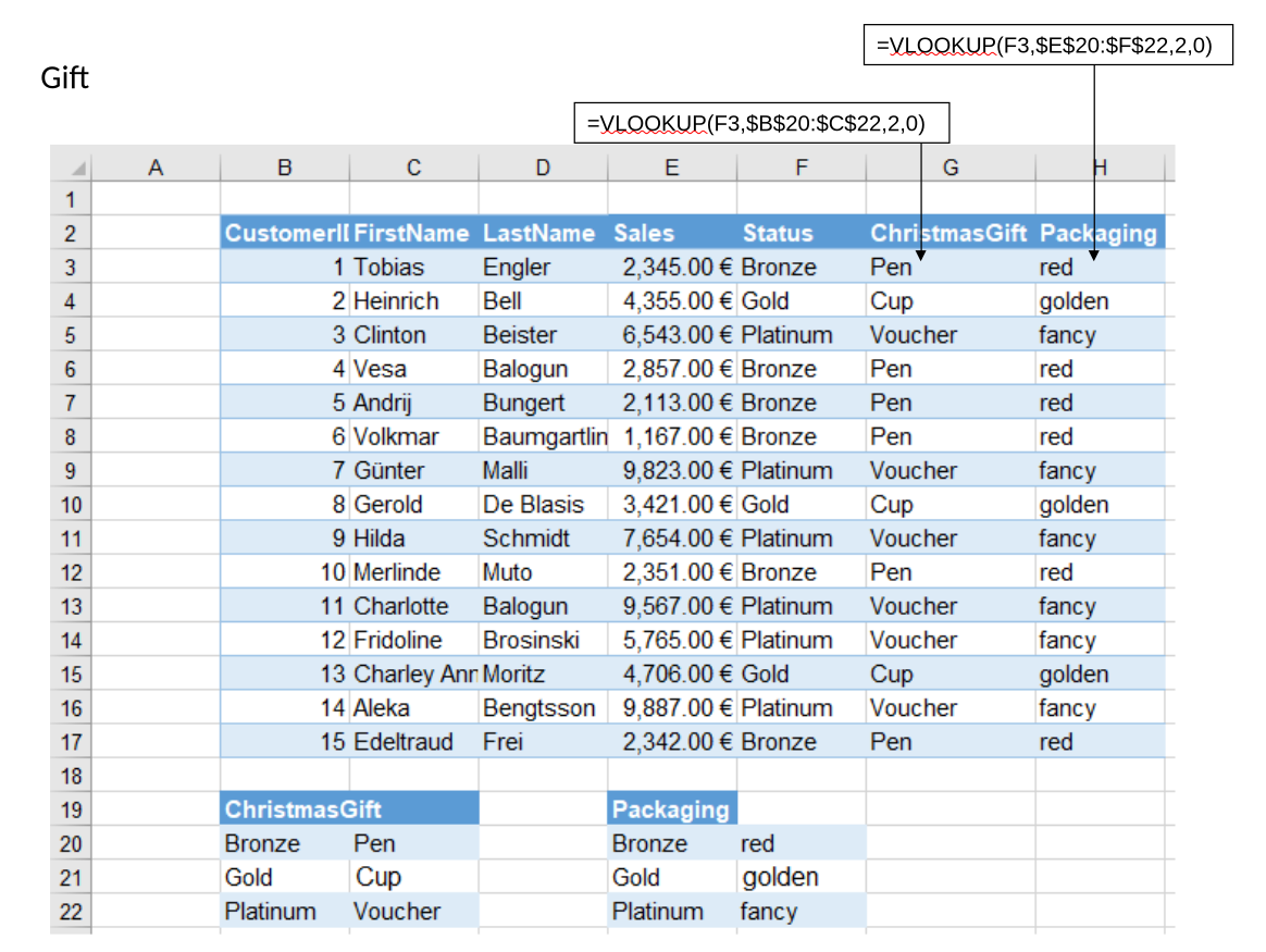
Homework solution ../materials/session_01/exercises_with_solutions.xlsx – Sheet: Gift
Students should retrieve two values based on customer status:
- Christmas gift
- Packaging
The values come from two different lookup tables.
VLOOKUP solution
Review:
- The lookup value is the customer status.
- The lookup column must be the first column of the selected table.
- The return-column number is 2.
- Use
FALSEfor an exact match. - Lock the lookup ranges before copying the formulas.
XLOOKUP solution
Copy the sheet before creating the XLOOKUP solution.
Contrast the formula structure with VLOOKUP:
=XLOOKUP(lookup_value,lookup_array,return_array)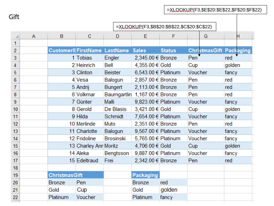
Homework review: Course grading
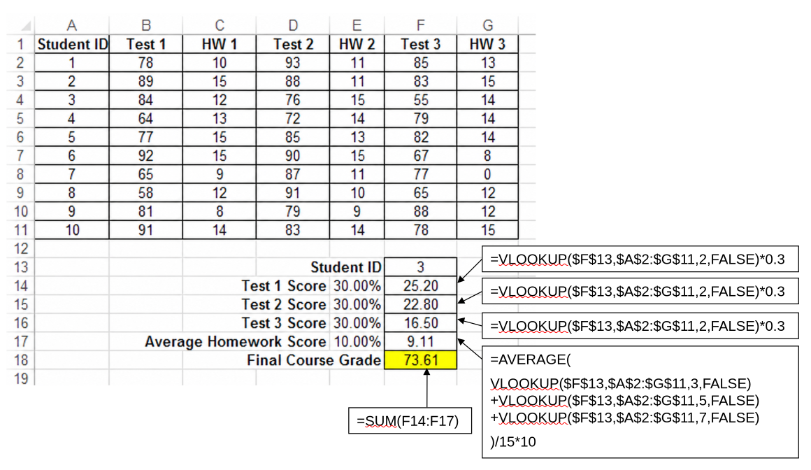
Homework solution ../materials/session_01/exercises_with_solutions.xlsx – Sheet: Grading
VLOOKUP solution
Review the sequence:
- Retrieve the homework and exam scores.
- Calculate the contribution of each assessment component.
- Add the contributions to obtain the final course grade.
Note
- Lookup functions return one value, this means three lookups are required for the homework part
- In Excel 365, it is possible to select a set of return columns
{3,5,7}.
Validation: Change the StudentID and check that the workbook retrieves the corresponding scores and recalculates the final grade.
For the illustrated student, check:
- Homework contribution:
9.11 - Final course grade:
73.61
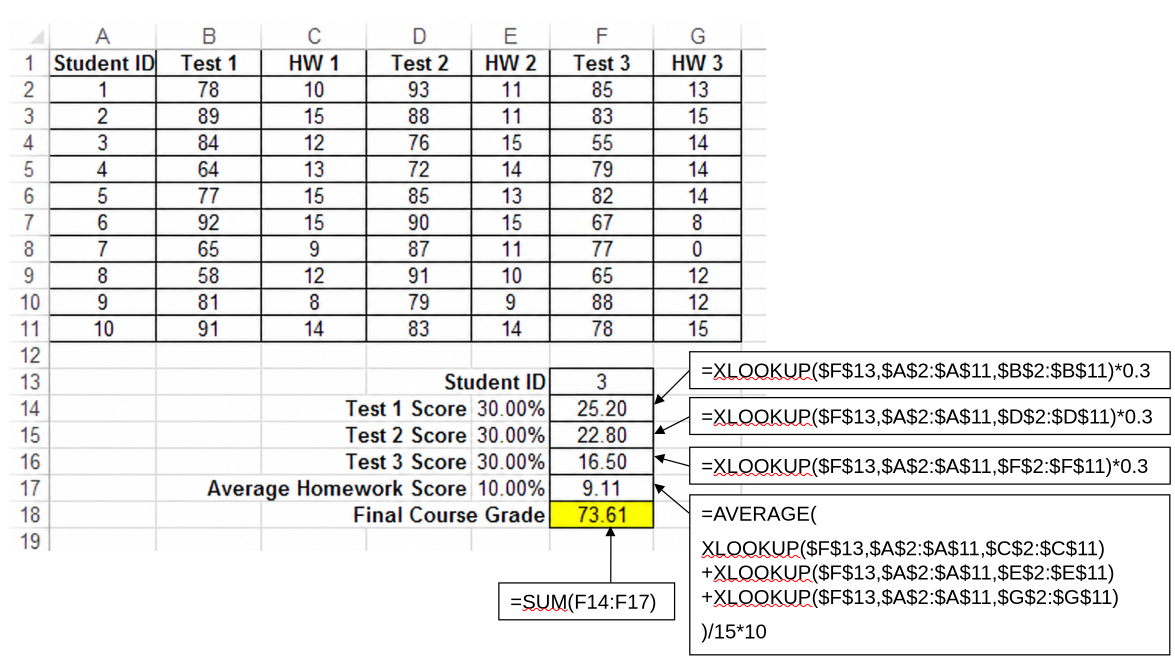
XLOOKUP solution
Copy the sheet and replace the VLOOKUP formulas with XLOOKUP.
Emphasize that each score column has its own return array, while all formulas use the same StudentID lookup array.
TipIn-class exercise on Excel Tables: Sales table
Complete the in-class exercise on Excel Tables Sales table if it was not completed in the previous session.
Use the teaching notes for Session 2.
Slides 54–60 — Pivot tables: From data to management questions
In-class demo ../materials/session_01/exercises.xlsx – Sheets: Sales_data | Sales_pivot
Refer to the Excel Table example (from previous session): highlight that manually writing formulas for aggregate and conditional statistics can be tedious (e.g., by product, region, time). PivotTables help for that.
Slide 65 — Creating a PivotTable
Before creating the PivotTable, briefly check that:
- Each column has one header.
- Each row represents one observation.
- There are no blank header cells.
- Numerical facts are stored as numbers.
- Dates are stored as actual Excel dates.
Demonstrate the process in Excel: Select source dataset > choose Insert → PivotTable
Remember to explicitly refresh the data through the ribbon.
Tip
Insert an Excel Table first, then Insert a PivotTable (PivotTables could be created without an Excel Table, but the references are much clearer with object names)
Example: Build the reports from the slides step by step
Key message:
A PivotTable makes it possible to generate different analytical views from the same underlying records without manually constructing each summary table.
Begin with the decisions and questions that the data should support (instead of the mechanics of PivotTables).
Ask students to modify one field at a time and predict the resulting table before releasing the mouse button.
Show that the same sales data can answer different questions by creating pivot tables for the following:
What is total turnover in 2020?
- Filter for
year = 2020 - Values:
Sum of turnover - Filter for
category, useactual
Demonstrate two kinds of filters:
- Report filters above the PivotTable
- Filters attached to row or column labels
For demonstration: Filter the product columns to retain only selected products.
Emphasize:
- Filtering changes the displayed slice.
- It does not delete the underlying observations.
- Grand totals are recalculated based on the active filter.
What is turnover by product group in 2020?
- Drag
productto rows
What is turnover in the first three months of 2020?
- Drag
monthto columns - Filter for first three months
What is turnover by region in the first three months of 2020?
- Remove
productfrom rows - Drag
regionto rows
What is the turnover in each region by product group in 2019 and 2020?
- Columns: Remove
month, addproduct - Rows:
region, thenyear - Filter:
year, for 2019 and 2020.
How can we show turnover as a percentage of total?
- Right-click,
Show values as, try and interpret different options - Undo
- Select the right-click, `Value Field Settings’, show option to display averages, …
Distinguish carefully between:
- The numerical aggregation used to create a value
- The way the resulting value is displayed
For example:
- Aggregation:
Sum - Display:
% of Grand Total
Explain a common error: When Excel interprets a numerical column as text, it may use Count instead of Sum.
How do actual and target values compare?
- Drag
categoryto columns - Remove filter for
category
How can (sub)totals be modified?
Through Design ribbon:
- Subtotals
- Grand totals (e.g., Off for rows and columns).
TipSummary
- Creating a PivotTable
- Selecting columns/rows (first/second/third… order)
- Filtering to select values
- Changing Values (Sum, Percentage, ….)
- Values selection: can include different attributes (e.g., cost and turnover) or differnt aggregations of the same attribute (e.g., sum and average of turnover)
Break — 10 minutes
Slide 73 — PivotCharts
Do-it-yourself: pp.55-60.
Create a PivotChart from the current PivotTable.
Demonstrate that:
- The chart is connected to the PivotTable.
- PivotTable filters also change the chart.
- Fields can be filtered directly through the chart controls.
Slide 74 — Calculated fields
PivotTable Analyze → Fields, Items & Sets → Calculated Field
Create a calculated field:
Name: Profit
Formula: =Turnover-Cost
Add the calculated field and use it in the Values area.
Key point:
Calculated fields refer to source-field names rather than worksheet cells.
Slide 75 — Grouping dates
Important: Create PivotTable for the Store_data sheet, which contains dates!
In-class demo ../materials/session_01/exercises.xlsx – Sheets: Store_data | Store_pivot
Explain that PivotTables can aggregate an actual date field automatically.
Demonstrate:
- Place the date field in Rows.
- Observe auto-grouping (years/quarters/months)
- Highlight that the original data is more granular
- Right-click one of the dates.
- Select Group.
- Unselect
Months,Quarters, andYears. SelectDays.
Theory : Data warehouse concepts, including data cubes and facts vs dimensions
Typically, there are some attributes that we will use for the values and others that will be used for rows, columns and filters. For values, we need data that can be aggregated numerically (e.g., through sum functions), for the others, we prefer categorical data that allows us to group observations. These we refer to as facts and dimensions. This corresponds to the multi-dimensional hypercube analyses in Excel (a type of analysis that we will also see in other analytical software packages).
Slide 61 — Facts and dimensions
Introduce the distinction using the table on the slide.
Typically, there are some attributes we use for values (numerical, that can be summarized, facts), others for rows and columns (for grouping, filtering, dimensions).
| Type | Purpose | Examples |
|---|---|---|
| Dimensions | Describe, classify, group, or filter data | Region, product, category, month, year |
| Facts | Numerical values that can be aggregated | Turnover, cost, profit, quantity |
Revisit Slides 56–61. Select two or three examples and ask students:
- Which number is being aggregated?
- Which categories are used to divide the number?
- Which values are fixed or filtered?
Slides 62–63 — Data cube and slicing
Use the cube as a conceptual model. Explain:
- Each dimension provides a perspective on the data.
- A fact is stored for combinations of dimension values.
- A PivotTable therefore presents a two-dimensional slice of a multidimensional dataset.
- Filters fix the dimensions that are not currently shown in rows or columns.
Slide 76 — Exercise: Exporter pivot tables
In-class exercise ../materials/session_01/exercises.xlsx – Sheets: Exporter_data | Exporter_pivot
Leave enought time (10 min) for the summary.
Complete this exercise in class only if sufficient time remains. Otherwise, assign it as homework.
Note: The tasks often leave it open if we select attributes for the rows or columns. It is specified unambiguously when we display the expected output table (as in the exam).
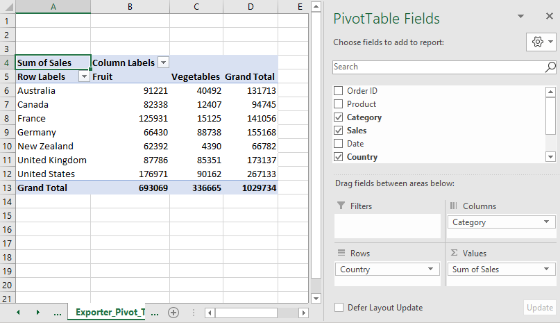
Task 1 — Category sales by country
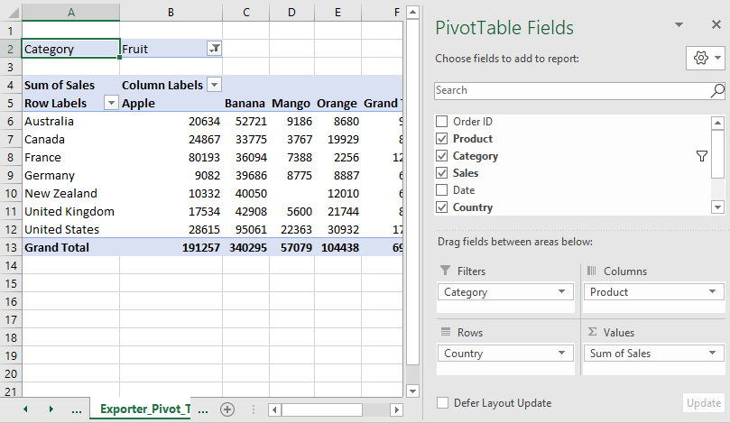
Task 2 — Fruit-product sales by country
- Filter for the fruit category.
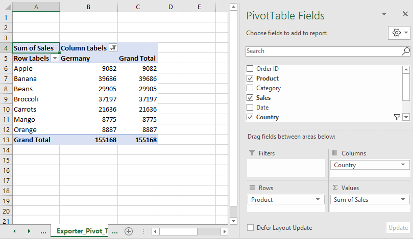
Task 3 — Product sales in Germany
Use column label filter to select Germany (or add country in Filters and select Germany there).
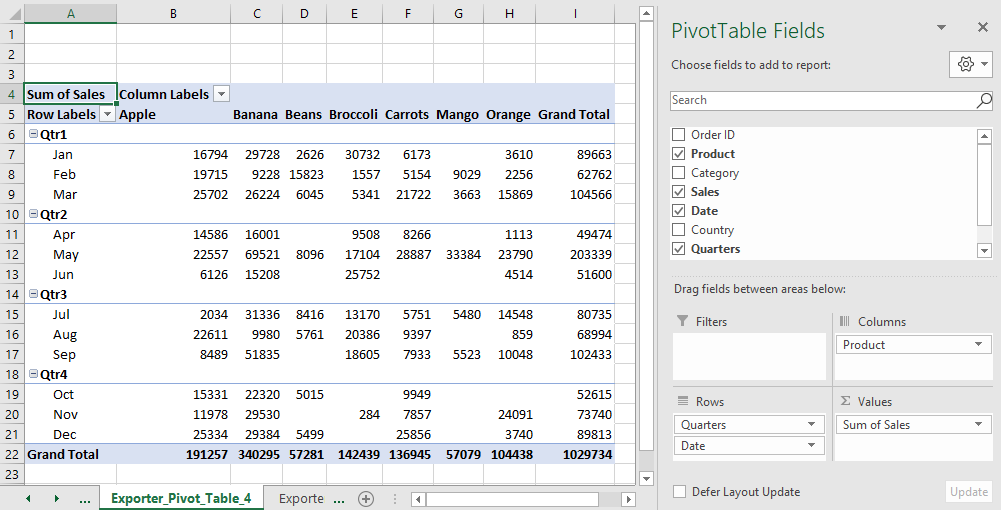
Task 4 — Product sales by quarter and month
Group the date field (right click on a date cell) by:
- Quarters
- Months
Then, expand Quarters to show Months.
Task 5 — European countries in Q4
- Use
Countryfilter to select European countries:[Germany, France, United Kingdom]. - Filter the grouped date field to Q4.
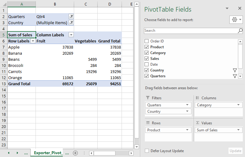
Never use IDs (like OrderID) in a PivotTable. It is a string that can neither be aggregated nor grouped meaningfully.
Slide 78 — Exercise: Expeditioner pivot analysis
In-class exercise/Homework ../materials/session_01/exercises.xlsx – Sheets: Exped_data | Exped_pivot
Note: Sales refers to the REVENUE column (unless we refer to the number of products).
- Briefly inspect the dataset and available attributes.
- Reproduce the report shown on the slide:
Tip
To replace the generic Column Labels/Row Labels, select Report > Layout > Show in tabular form.
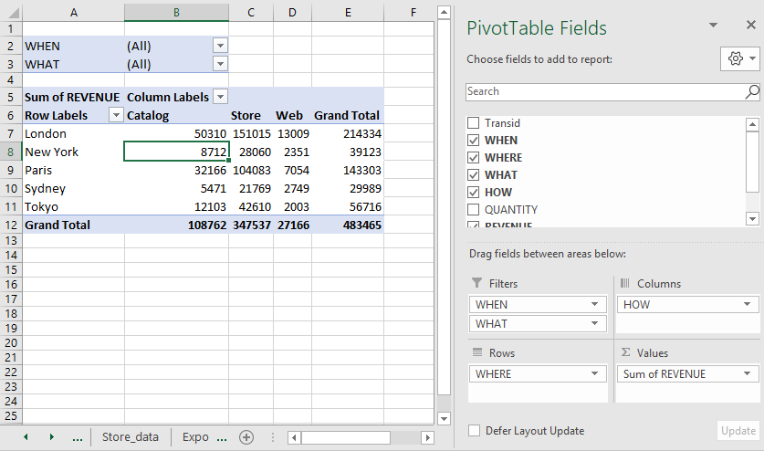
Question 1 — London catalog sales in Q1
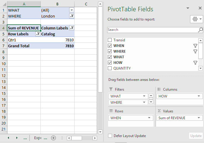
- Move
WHENfrom Filters to Rows so the dates can be grouped and compared. - Move
WHEREfrom Rows to Filters, then filter it to London. - Right-click a date (or select a date and choose Group Selection), choose Group, select Quarters, and deselect Months if necessary.
- In the
HOWcolumn field, show Catalog only. Read the Catalog value for Qtr1.
Question 2 — Tokyo Q4 Web sales as a percentage of annual sales
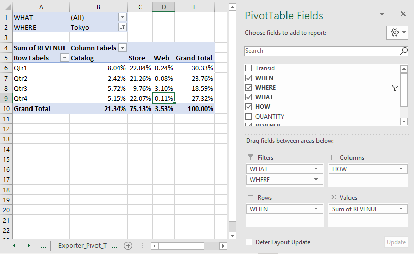
- Filter
WHEREto Tokyo. - Keep
HOWin Columns, groupedWHEN/ Quarters in Rows, andREVENUEin Values. - Open Value Field Settings, choose Show Values As, and select % of Grand Total. This makes every cell a share of Tokyo’s annual total across all channels.
- Read the Web value for Qtr4.
Question 3 — Sydney annual Catalog share
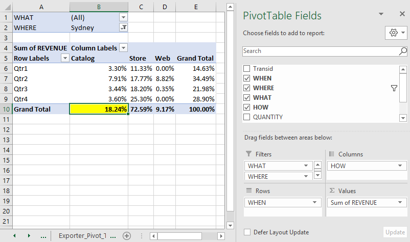
- Filter
WHEREto Sydney. - Keep
HOWin Columns, groupedWHEN/ Quarters in Rows, andREVENUEin Values. - In Value Field Settings > Show Values As, select % of Grand Total.
- Use the Grand Total row in the Catalog column; this combines all quarters and therefore gives the annual Catalog share.
Question 4 — Camel saddle sales for Paris by quarter
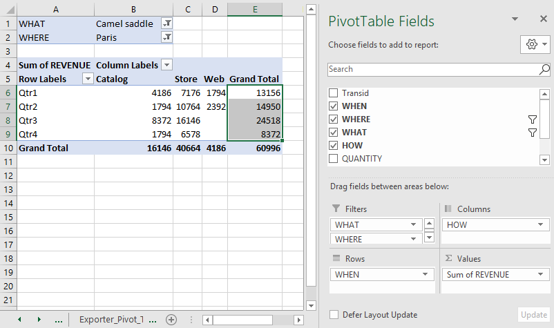
- Filter
WHATto Camel saddle andWHEREto Paris. - Put grouped
WHEN/ Quarters in Rows, keepHOWin Columns, and keepREVENUEin Values as Sum of REVENUE. - Read each quarter from the Grand Total column, which adds the sales channels for that quarter.
Question 5 — London January Catalog sales and source transactions
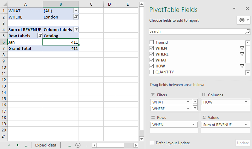
- Filter
WHEREto London and restrictHOWto Catalog. - Change the
WHENdate grouping from Quarters to Months, then read the January value.
TipInspecting results
- To inspect the contributing records, double-click
411(or use Show Details). Excel creates a new worksheet containing the source records behind that PivotTable cell. - The two records are:

- Check that
275 + 136 = 411.
Question 6 — Elephant polo stick quantities in New York by month
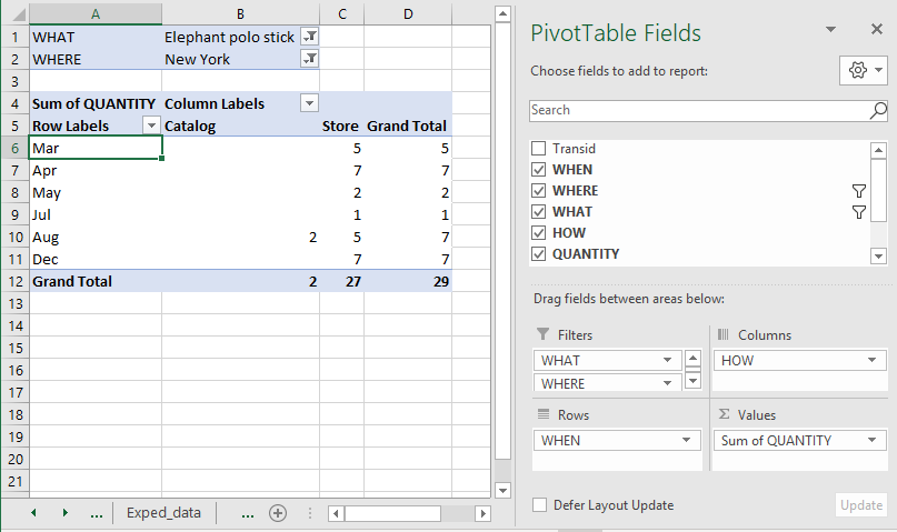
- Filter
WHATto Elephant polo stick andWHEREto New York. - Group
WHENby Months in Rows. - Remove
REVENUEfrom Values, addQUANTITY, and confirm that the calculation is Sum of QUANTITY. This reports units sold rather than sales value. - Read the quantities for the months displayed in the PivotTable; do not infer values for months that are absent.
Summary and announcements
Homework:
- Complete the Exporter exercise if it was not finished.
- Complete the Expeditioner exercise.
Summarize/review the Excel part, collect questions for the Mid-term exam.
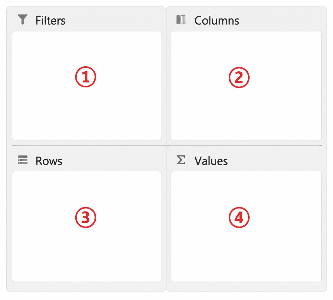
Make sure students are prepared for the typical exam question the Pivot-table creator (giving a list of variables for fields 1, 2, 3, 4):
Solve Mock exam (we will go through solutions very quickly next time; Solutions will be available on 2026-09-28 on Canvas).
End on a positive note for the exam
- You solved the exercises
- I feel we have not lost anyone, you kept working and asking the right questions
- Continue to work together, form groups, seize the momentum for the Python sessions!
Next session:
- Introduction to Python and pandas.
- Transition from Excel tables and PivotTables to tabular data structures in Python.
TipPrepare and develop Excel skills
Revisit the sports analogy: prepare and practice (beyond the exam). Others will judge your competence by how efficiently you use your sports equipment or the software. Know how to use your equipment (use shortcuts/prepare cheatsheet). Maybe you can solve the loan sheet in 1 minute.
See Excel cheatsheet.
TipNotes for improvement
Take notes on timing, common errors, unclear instructions, and suitable stopping points on a separate paper and add them to feedback.qmd after the session.