Describe variables, relationships between variables, and underlying structure in the data (e.g., clusters).
Prepare and explore data sets using appropriate descriptive and visual techniques.
Explain the role of exploratory data analysis in business decision-making.
Table of contents
Foundations
Before building analytical models, analysts typically engage in data preparation and exploratory data analysis (EDA).
These activities are closely intertwined and often iterative: we prepare and structure the data while simultaneously exploring it to understand its characteristics and potential issues.
Typical activities include:
Data preparation (e.g., structuring, cleansing, integration)
Goal: develop an initial understanding of the data, detect patterns or anomalies, and ensure that the data is suitable for further analysis or modeling.
Data preparation
Data types
Conducting EDA and representing the “real world” requires us to use appropriate data types. Typically, we distinguish four fundamental data types, known as measurement scales:
Qualitative description of objects
Nominal (special case: binary)
Ordinal
Quantitative description objects
Interval
Ratio
Qualitative: Nominal scale
Values of a nominal (aka. categorical) attribute are symbols or names of things
Each value represents some kind of category, code, or state.
This scale assumes existence of a finite number of equivalency classes, where each class is named or labeled.
The values do not have any meaningful order.
Examples:
Hair color = {black, blond, brown, gray, red, white, …}
Postal codes = {96047, 96048, …}
Special case of the nominal scale: Binary scale – also called Boolean
Nominal attribute with only 2 states
0/FALSE typically means absence and 1/TRUE presence.
Examples:
Smoking: 1 indicates patients in a trial that smoke, 0 otherwise.
Purchase: 1 indicates that a person purchased a product, 0 otherwise.
Qualitative: Ordinal scale1
A categorical attribute with values that have a meaningful order, but the magnitude between successive values is not known
The ordinal scale is useful for registering subjective assessments and things that cannot be measured objectively (often used in surveys for ratings)
Values cannot be multiplied or added, even if the numbers belong to the same scale.
Relations between values:
Transitivity: If A>B, B>C, then A>C,
Symmetry: : If A>B, then B<A
Examples:
School grades = {A < B < C < D < E < F} or {1 < 2 < 3 < 4 < 5 < 6}
Places in a competition = {1st, 2nd, 3rd, 4th, …}
Quantitative: Interval scale
A numeric measurable attribute in the form of integer or real values. The distance between the numbers or units on this scale is equal over all levels of the scale. Values of the interval scale have no natural “zero” point.
Invariant under a linear transformation 𝑎𝑥 + 𝑏, 𝑎 > 0, 𝑏 ≥ 0
Although the sum of two interval-scale measurements is not meaningful by itself, their average can be computed
Examples:
Celsius scale of temperature (there is no natural zero, 0°C is arbitrarily defined), a Celsius value 𝑐 can be linearly transformed to a Fahrenheit value 𝑓: 𝑓 = 9/5 ∗ 𝑐 + 32
Dates and time (e.g., conversion from Julian to Gregorian calendar is possible)
Quantitative: Ratio scale
Numeric values with a meaningful zero point (e.g., “zero” means absence)
All arithmetic rules and functions can be applied (addition, subtraction)
Kelvin (K) temperature (has a true zero-point (0 °K=− 273.15 ℃): It is the point at which the particles that comprise matter have zero kinetic energy
Scales and mathematical operations
Due to the different mathematical properties, not all statistical measures can be computed on different measurement scales:
Scale
Mathematical operations possible
Mode
Frequency
Percentiles / Median
Mean / Variance / SD
Nominal
=, ≠
X
X
Ordinal
=, ≠, <, >
X
X
X
Interval
=, ≠, <, >, linear transformation
X
(X)
X
X
Ratio
=, ≠, <, >, *, /, +, −
X
(X)
X
X
(X) The frequency (relative / absolute) may be calculated for a numeric variable, but makes only sense when the number of possible values is low
Learning focus
No need to memorize the table.
Be able to explain the scales and give examples of operations that are appropriate.
Data quality and preparation
In business analytics, we rarely work with carefully curated datasets. Instead, data often comes from multiple systems, processes, and teams, where it is primarily created for operational purposes rather than analysis. Because these data sources are not always standardized or under the analyst’s control, quality issues are common:
Outdated values (e.g., customer address has changed)
Inconsistent formats or units (e.g., dates stored as text, mixed currencies)
Duplicate records (e.g., customers with multiple accounts)
Measurement or data entry errors (e.g., human data entry, broken sensors)
Before conducting analysis, we must ensure that the data is fit for use(Strong et al., 1997).
Typical data preparation actions
Data structuring
Data cleansing
Data integration
Data transformation
In many real-world analytics projects, data preparation and cleaning can take up to ~80% of the total effort.
Data structuring: Example
There are many ways to structure the same dataset.
Option A (wide)
Region
Year
Sales_Q1
Sales_Q2
Sales_Q3
Sales_Q4
Europe
2023
120
140
160
150
Asia
2023
100
110
120
130
Option B (long)
Region
Year
Quarter
Sales
Europe
2023
Q1
120
Europe
2023
Q2
140
Europe
2023
Q3
160
Europe
2023
Q4
150
Asia
2023
Q1
100
Asia
2023
Q2
110
Asia
2023
Q3
120
Asia
2023
Q4
130
➡ Which would you select as an input for a data analytics tool?
→ Solution: Option B, because this is what data analytics tools typically expect.
Data structuring: Principles
Data structure typically expected by data analytics tools
Vocabulary
A dataset is a collection of values (e.g., nominal, categorical, numeric).
Each value belongs to a variable and an observation
Expected data structure
Each variable forms a column
Each observation forms a row
Each type of observational unit forms a table
Data must be structured according to the expectations of the analytical tool being used. Reviewing the tool’s documentation and example datasets can help clarify the required format.
For analytical purposes, redundant values are often acceptable. The goal is to organize data into a tidy structure, where each row represents one observation and all relevant variables are available for analysis.
Data transformation: Example
Often, the way data is stored determines which mathematical operations are possible.
Example: timestamps stored as strings
user_id
timestamp
101
“2025-03-12 14:23:05”
102
“2025-03-12 18:02:11”
103
“2025-03-13 09:15:42”
If treated as a string, we can only perform operations such as:
equality checks (= / ≠)
simple filtering or sorting
This severely limits analysis.
Format conversions help transform raw data into representations suitable for EDA and analytical models:
Representation
Example
Possible analysis
Numeric timestamp
1741789385
time differences, time series
Hour of day
14
activity patterns during the day
Day of week
Wednesday
weekday vs. weekend behavior
Day of year
71
seasonal patterns
Data preparation transforms raw data into formats that allow meaningful mathematical operations and analysis.
Univariate exploratory data analysis
Foundations
People are not very good at looking at a column of numbers or a whole data table and then determining important characteristics of the data. EDA techniques have been devised as an aid in this situation.
The following forms of EDA are typically distinguished:
Univariate
Multivariate
Non-graphical
mean, median frequencies
cross-tabs correlations
Graphical
histograms dot plots
scatter plots clustering
Descriptive statistics
How to describe data (not the data type)?
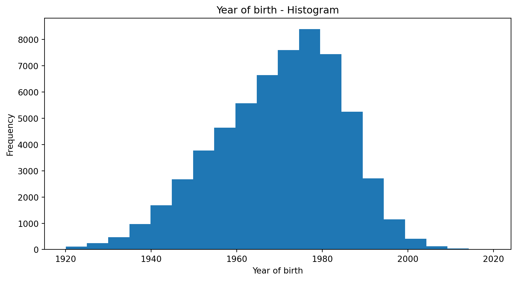
Customer ID
Name
Year of birth
Tariff
100216
Kevin Meyer
1983
A
271692
Lars Knopp
1963
B
892615
Anton Albert
1954
C
331625
Peter Pan
1988
D
…
…
…
…
What are the “key figures” of a distribution?
Graphics work well for single variables, but for comparison of different variables and their distributions and later working with the data, numeric indicators are necessary
Descriptive statistics provide us with numbers describing the characteristics of a distribution
For qualitative / categorical data
Mode
Relative frequency
For quantitative / numerical data
Mean (also known as Expected Value) – describing the position of the center
Variance (or Standard Deviation) – describing the spread
Percentiles (also known as quantiles / quintiles) – more detailed figures on the distribution
Describing data using descriptive statistics
Basic statistical descriptions can be used to identify characteristics of the data and highlight which data values should be treated as noise or outliers.
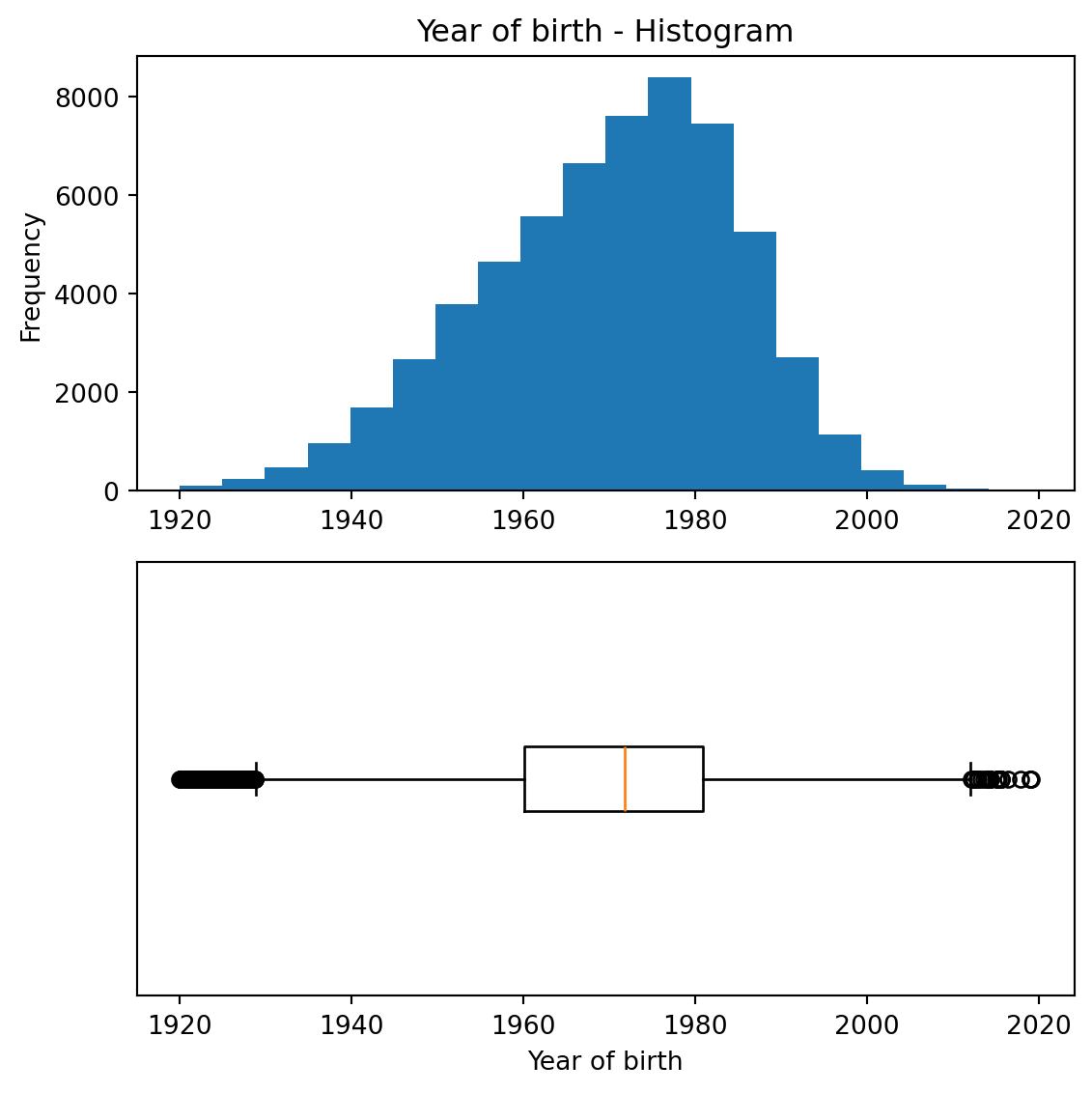
A good way to get an impression of continuous / numeric data is the histogram.
The graph shows the range of observations on the horizontal axis, with a bar showing how many times each value occurred in the data set.
Mode
The mode is the value that appears most in a set of data values
The highest mode also has the highest relative frequency (see next slide)
Example: On a party, you meet many other students, and you ask what they are studying.
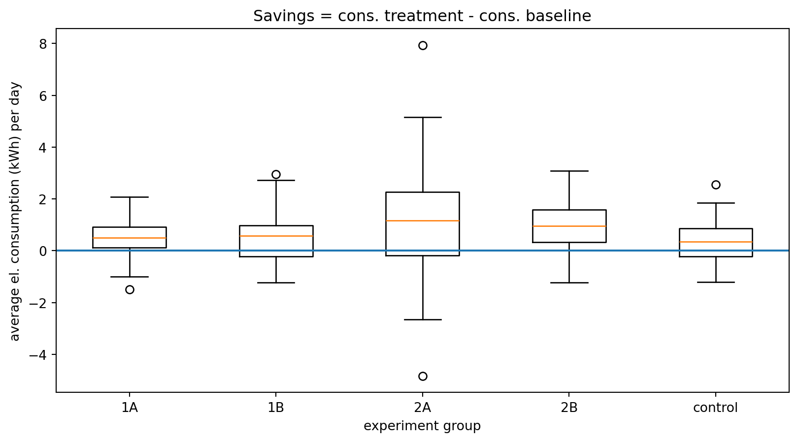
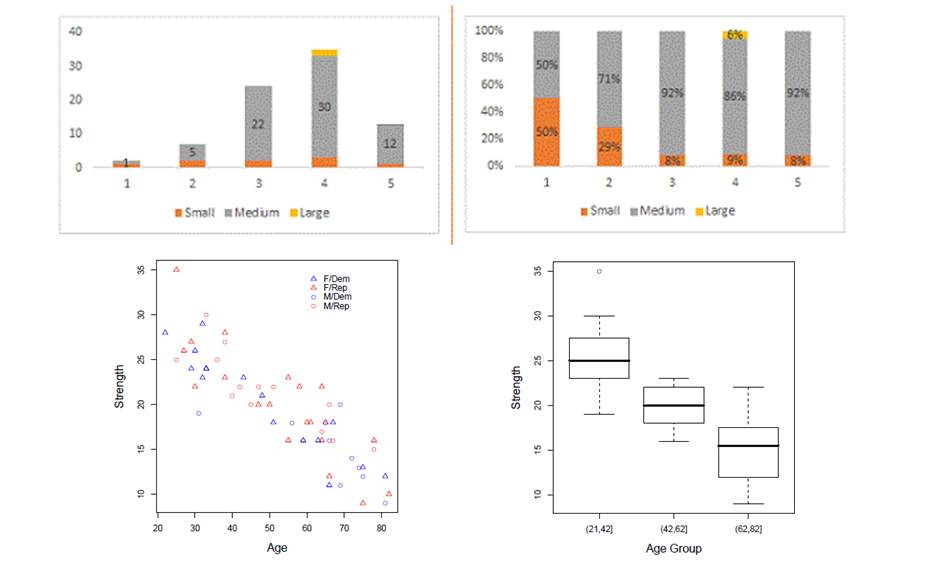
Boxplot
The boxplot is a condensed illustration of a distribution
It consists of
Median (thick line)
25% / 75% percentiles
“Whiskers”: the quartiles ± 1.5 × IQR
Outliers that are higher/lower than the whiskers
Boxplots can be used to compare different distributions
Example:
In an experiment, households received different types of feedback on their electricity consumption
The “control” group received no feedback
The plot shows boxplots of the savings in electricity consumption after three weeks with feedback
One can – for example – see that there is a higher spread in group 2A compared to the others
Multivariate exploratory data analysis
Multivariate non-graphical EDA
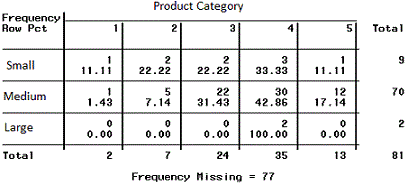
Multivariate non-graphical EDA techniques generally show the relationship between two or more variables in the form of either cross-tabulation for categorical variables or correlation statistics for numerical variables.
Multivariate graphical EDA
Multivariate graphical EDA techniques are scatterplots for numerical variables, Barcharts for categorical variables, or Boxplots for mixed types.
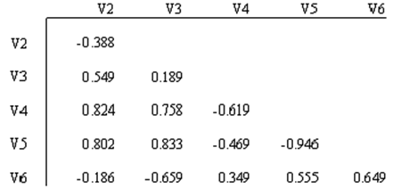
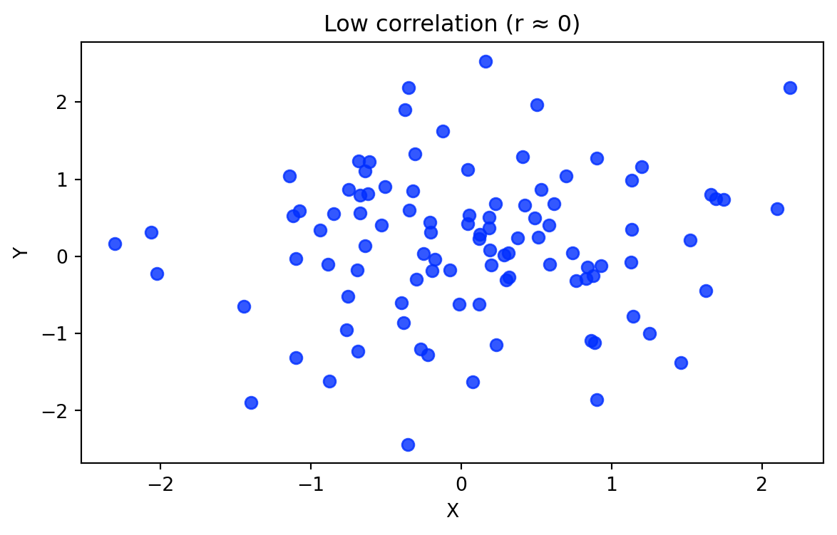
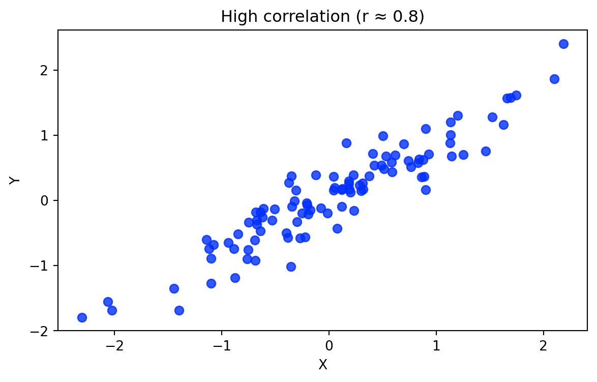
Bivariate statistics: Correlation
Correlation measures how strongly two variables move together. Suppose we observe two variables for the same observations:
\[X = (x_1, x_2, ..., x_n)\]
\[Y = (y_1, y_2, ..., y_n)\]
The Pearson correlation coefficient is calculated as:
Bivariate correlations are often insufficient for prediction or explanation, requiring more powerful analytical models.
If causal explanations are unavailable, decisions may need to rely on predictions.
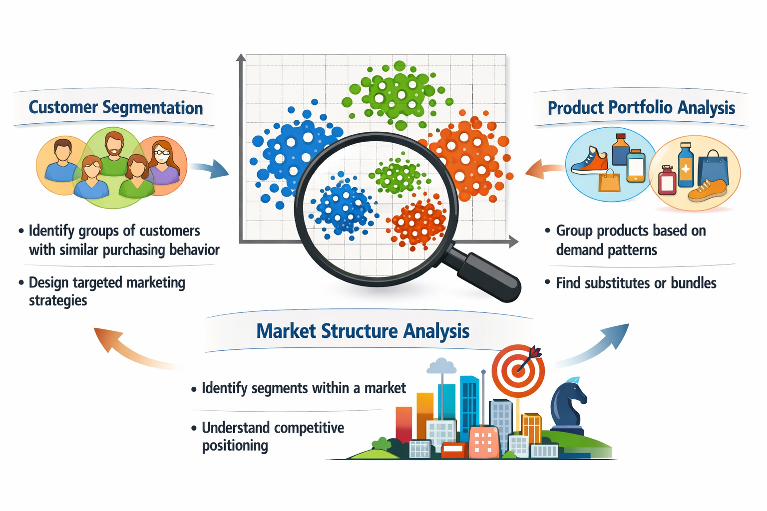
Clustering in EDA
In multivariate exploratory data analysis, we often want to understand whether observations form natural groups.
Clustering is an EDA technique that groups similar observations based on their characteristics.
Common use cases include:
Families of clustering methods
Clustering algorithms can be grouped into several families of approaches.
Family
Examples
Key characteristics
Segmentation / Partitioning methods
k-means, k-medoids (PAM), bisecting k-means
divide observations into k predefined clusters; scalable for large datasets; widely used for business/customer segmentation
Hierarchical methods
Agglomerative clustering, divisive clustering
clusters formed through successive merging or splitting; produce dendrograms (cluster trees); useful for exploratory structure discovery
Density-based methods
DBSCAN, HDBSCAN
clusters defined as regions of high density; identify arbitrary shapes and outliers/noise
Probabilistic / model-based methods
Gaussian mixture models
clusters modeled as probability distributions; allow soft cluster membership when groups overlap
In this lecture we focus on k-means (segmentation) and agglomerative hierarchical clustering.
Segmentation clustering
Segmentation methods divide observations into k clusters.
Goal:
maximize similarity within clusters
maximize differences between clusters
The most widely used algorithm:
k-means clustering
Key assumption:
clusters are roughly spherical and similar in size.
k-means algorithm
For a given k, the algorithm finds cluster centers that minimize within-cluster sum of squares.
Steps:
Randomly assign data points to k clustersLoop: calculate centroids for each clusterfor each data point: compute distance to all centroidsif x isnot closest to its current centroid: assign x to the nearest centroidif no changes in centroids and cluster assignments:break
Strengths: fast and scalable, easy to interpret
Limitations: must choose k, sensitive to scaling and outliers.
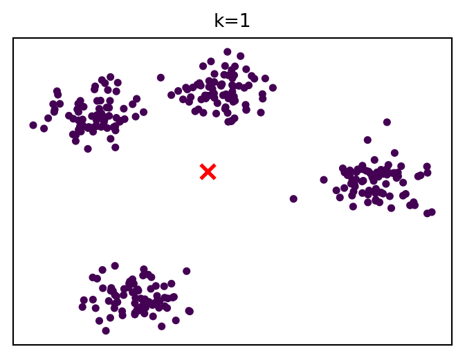
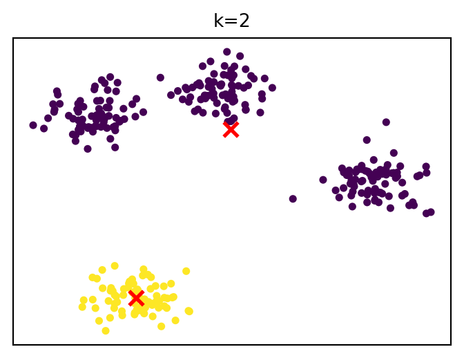
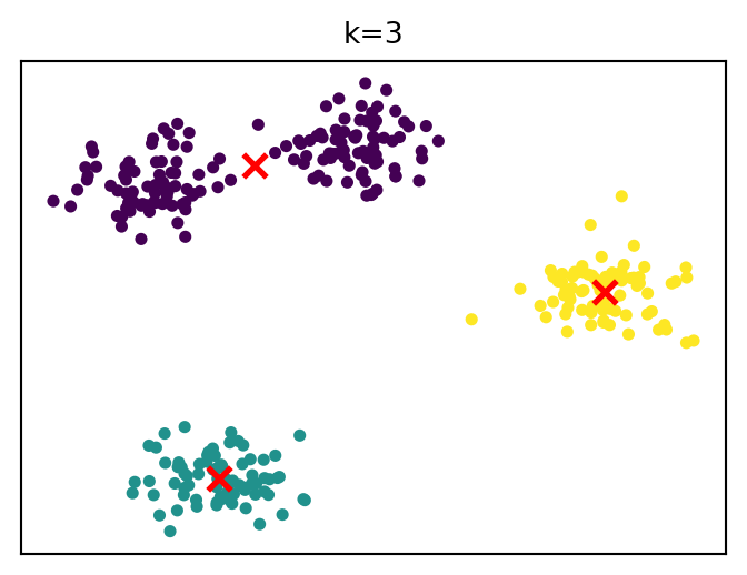
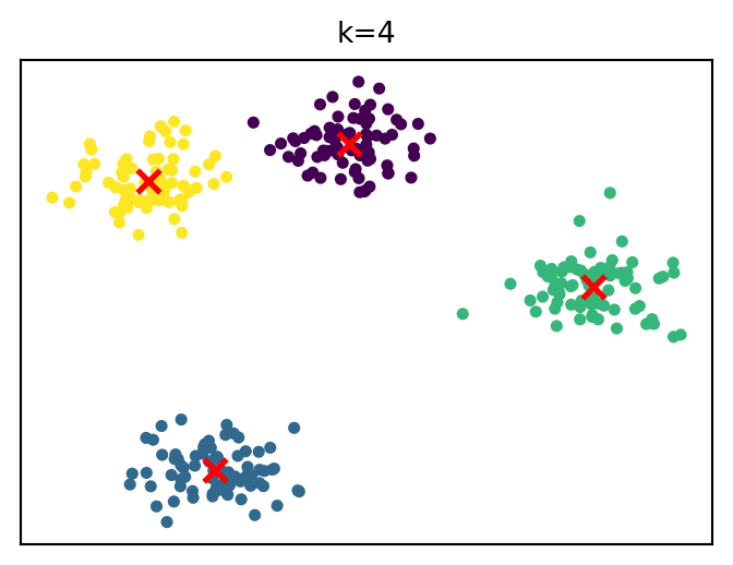
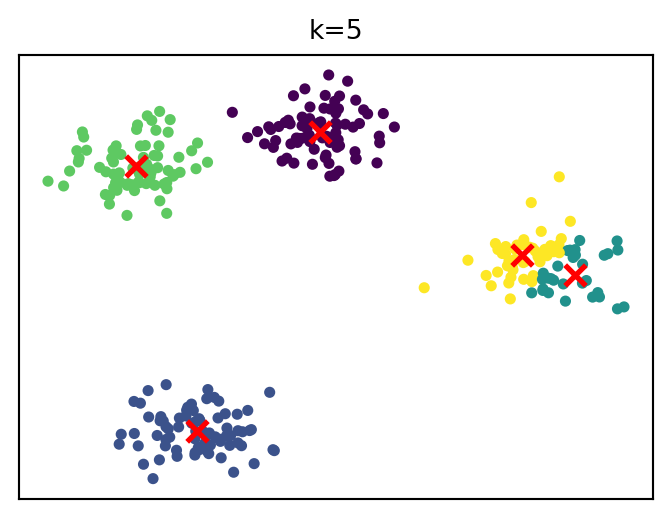
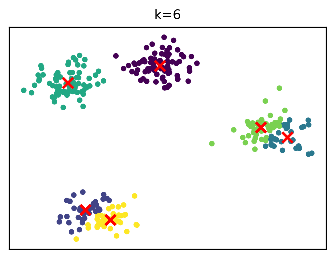
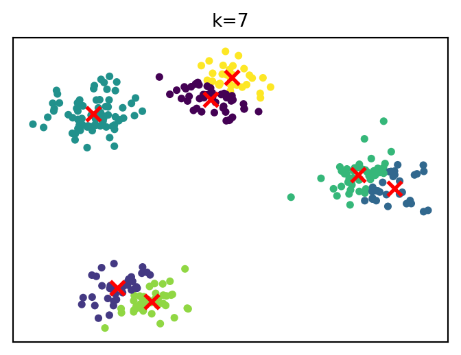
How cluster solutions evolve
…
k-means in Python
The following runs a k-means clustering analysis in Python:
from sklearn.cluster import KMeanskmeans = KMeans(n_clusters=k)labels = kmeans.fit_predict(X)
KMeans(...) + fit_predict(X) runs the iterative algorithm we saw earlier:
initialize centroids, assign points to the nearest centroid, update centroids (repeat until convergence)
It returns an array of cluster labels (corresponding to each observation). . . .
Input data X must have a specific structure, as discussed in data preparation:
rows = observations (data points)
columns = features (dimensions)
Example:
X = [ [1.2, 3.4], [1.0, 3.0], [5.5, 8.1],]
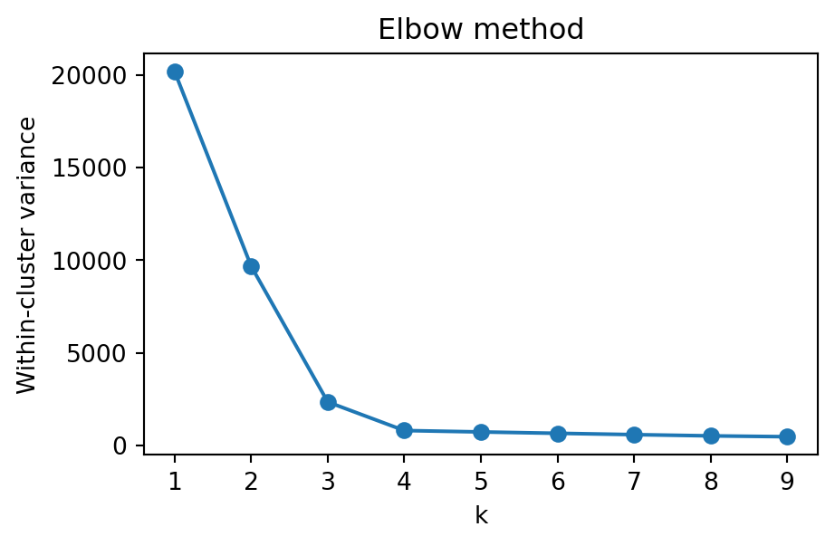
Choosing the number of clusters
A common heuristic is the elbow method.
Idea:
increase k
measure improvement in model fit
look for point where improvement slows
Example metric: within-cluster variance (inertia)
Choose k at the “elbow” (diminishing returns)
Choosing the number of clusters
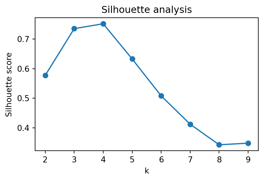
An alternative is the silhouette score.
Idea:
evaluate cohesion (within clusters)
evaluate separation (between clusters)
combine both into a single score
Choose k that maximizes the score
Higher = better separation and compactness
Hierarchical clustering
Hierarchical clustering builds a tree of clusters.
There are two types of hierarchical cluster methods:
Agglomerative hierarchical clustering is a bottom-up clustering method. It starts with every single data object in a single cluster. Then, in each iteration, it agglomerates (merges) the closest pair of clusters by satisfying some similarity criteria, until all the data is in one cluster.
Divisive hierarchical clustering is a top-down clustering method. It works similarly to agglomerative clustering but in the opposite direction. This method starts with a single cluster containing all data objects, and then successively splits resulting clusters until only clusters of individual data objects remain.
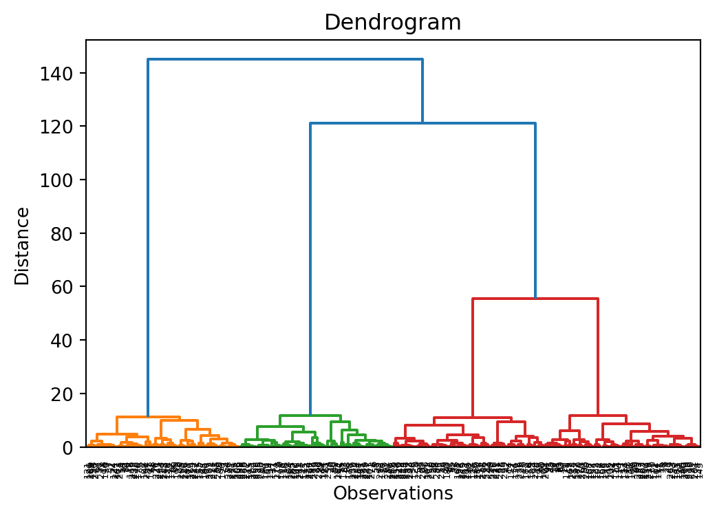
Dendrogram
A dendrogram is a tree diagram frequently used to illustrate the arrangement of the clusters produced by hierarchical clustering. The y-axis represents the value of this distance metric (e.g. Euclidean distance) between the clusters.
In a dendrogram the widths of the horizontal lines give an impression about the dissimilarity of the merging object. Thus, a good cluster number might be at a point from where the width of the following horizontal lines is significantly shorter.
This allows us to explore clusters at multiple levels of granularity.
Measuring similarity between clusters
When merging clusters, we must define distance between clusters.
Common linkage choices:
single linkage
nearest neighbor distance
complete linkage
farthest neighbor distance
average linkage
average pairwise distance
Ward linkage
merges clusters minimizing variance increase.
Evaluation of clusters
⚠ Clustering algorithms will always produce groups, even when no meaningful structure exists.
Therefore, clusters must be evaluated.
Common evaluation approaches include:
internal validation
silhouette score
cluster stability
external validation
compare with known labels or metadata
interpretability checks
do cluster profiles make business sense?
Why clustering is useful in analytics workflows
Clustering often supports later analytical steps.
For example:
Customer segments in data warehouses
segments stored as features for reporting or dashboards
Heterogeneity in regression models
different segments may follow different behavioral patterns
subgroup analysis or separate models
Machine learning pipelines
clustering can generate features or latent groups
Hypothesis generation and model development
clusters can reveal previously unnoticed patterns or structures
these patterns may suggest new hypotheses about behavior or relationships in the data
clustering can therefore inform model specification, variable selection, or interaction terms
Summary
Exploratory Data Analysis (EDA) helps us understand data before modeling.
Key steps:
Prepare data
ensure data quality (missing values, outliers, formats)
structure data appropriately (rows = observations, columns = features)
Balijepally, V., Mangalaraj, G., & Iyengar, K. (2011). Are we wielding this hammer correctly? A reflective review of the application of cluster analysis in information systems research. Journal of the Association for Information Systems, 12(5), 1. https://doi.org/10.17705/1jais.00266
Strong, D. M., Lee, Y. W., & Wang, R. Y. (1997). Data quality in context. Communications of the ACM, 40(5), 103–110. https://doi.org/10.1145/253769.253804
Wickham, H. (2014). Tidy data. Journal of Statistical Software, 59, 1–23.